🔥 Design Webflow sites with AI

Animation breathes life into sliders, transforming static content presentations into engaging experiences that capture attention and guide user behavior.
However, the line between animation that enhances and animation that annoys is often thinner than designers realize. Poorly implemented slider animations create friction, distract from content, and ultimately harm conversion metrics. Thoughtfully designed animations, by contrast, improve comprehension, delight users, and subtly direct attention toward desired actions.
This guide explores the principles and practices that separate effective slider animations from counterproductive ones, providing actionable guidance for web designers seeking to optimize their implementations for both experience and business outcomes.
Every animation should serve a communicative purpose. Transitions between slides communicate that content has changed and help users maintain spatial orientation within the slider structure. Micro-interactions provide feedback confirming that user actions have registered. Attention-directing animations guide eyes toward calls to action or important information.
When animations lack clear purpose, they become visual noise that competes with content for attention. Before implementing any animation, ask what message the motion conveys. If the answer is unclear or merely "it looks nice," reconsider whether that animation serves your users.
Human vision evolved to detect and respond to movement. This biological reality means animated elements automatically attract attention, sometimes pulling focus from more important static content. Effective animation design works with this psychology rather than against it, using motion strategically to direct attention rather than scatter it.
Motion also creates expectations. An element that slides in from the right suggests that additional content exists in that direction. An expanding element implies that more detail will become visible. Animations should align with these intuitive expectations to avoid cognitive friction.
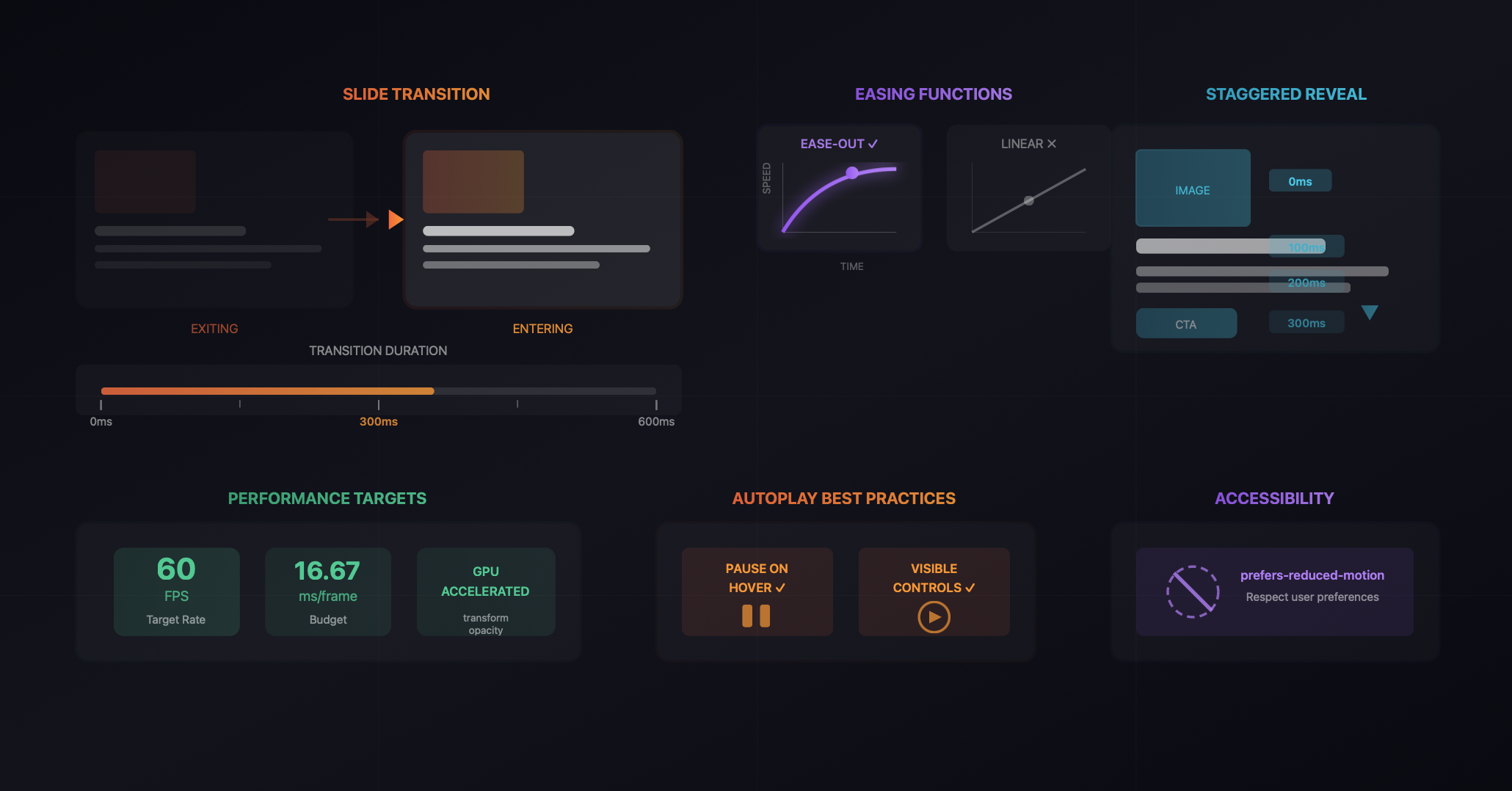
The duration of slide transitions dramatically affects user experience. Transitions that complete too quickly can feel jarring, leaving users uncertain about what changed. Transitions that take too long create impatience and interrupt the browsing flow.
Research suggests that transitions between 200 and 500 milliseconds typically feel natural for most slider contexts. Hero sliders with dramatic visual content can support slightly longer transitions of 400-600 milliseconds, while card carousels navigated by user input benefit from snappier 200-300 millisecond transitions.
The character of motion matters as much as duration. Linear transitions, where elements move at constant speed, feel mechanical and artificial. Natural motion accelerates and decelerates, and easing functions replicate this behavior in animations.
For slider transitions, ease-out functions that begin quickly and slow to a stop typically feel most natural. This motion pattern mirrors physical objects coming to rest and provides visual emphasis on the destination state. Avoid bounce or elastic easing for primary transitions unless the brand aesthetic specifically calls for playful, exaggerated motion.
The direction of slide transitions should reinforce the navigation logic. When users click the next arrow, slides should move in a direction that feels like progression. Typically this means new content entering from the right while old content exits left, matching the reading direction common in most interfaces.
Consistency in transition direction maintains spatial understanding. Users should intuitively know where they are within the slide sequence based on how content moves. Inconsistent or random transition directions create disorientation.
Beyond the primary slide transition, individual elements within slides can animate to create layered reveals. Headlines might fade in slightly before body copy. Images might scale subtly while text remains static. Call-to-action buttons might slide up after other content settles.
These staggered reveals create visual rhythm that guides attention through the content hierarchy. Primary elements appear first, drawing focus before secondary elements enter. This progressive disclosure helps users process complex slides without overwhelm.
When implementing staggered reveals, timing relationships between elements require careful calibration. Sequential delays should be short enough that the animation sequence completes before user attention wanders, typically within 600-800 milliseconds total. Longer sequences risk losing users before key elements appear.
The sequence order should match content priority. If the headline is most important, it should appear first. If the image is the hero element, let it lead. Never bury calls to action at the end of long animation sequences.
Exit animations receive less attention than entrances but equally influence experience quality. Content that abruptly disappears feels incomplete. Elements that fade or slide out provide closure before new content arrives.
Exit and entrance animations should feel related, creating coherent motion patterns that users quickly understand. If content enters by sliding from the right, it should exit by sliding to the left. This consistency reinforces the spatial model users build.
Animation smoothness depends heavily on implementation technique. Animations that trigger layout recalculations or paint operations struggle to maintain consistent frame rates, creating stuttering that undermines the desired polish.
Properties that can be hardware accelerated, specifically transform and opacity, enable smooth 60fps animations across most devices. Animating position, size, or other layout properties forces the browser to recalculate layouts repeatedly, degrading performance.
Mobile devices have less processing power than desktops, making animation performance even more critical. Complex animation sequences that perform adequately on development machines may stutter noticeably on mid-range mobile devices.
Test animations on actual mobile devices representative of your audience. Consider simplifying animations for mobile breakpoints if performance issues appear. Smooth simple animations outperform choppy complex ones.
Modern operating systems allow users to indicate preference for reduced motion, often for accessibility or vestibular sensitivity reasons. Respecting this preference is both an accessibility requirement and a demonstration of user-centered design values.
Slider implementations should detect reduced motion preferences and respond appropriately. This might mean replacing slide animations with instant cuts, removing entrance animations entirely, or substantially reducing motion intensity. The core content and functionality should remain fully accessible regardless of animation presence.
Autoplay sliders present unique animation challenges. The automatic progression must be paced to allow content consumption without rushing users. Transition animations must be smooth enough that repeated viewing does not become irritating.
The safest approach to autoplay is disabling it entirely, letting users control navigation. When autoplay serves legitimate purposes, such as displaying multiple promotions that users might otherwise miss, implement it thoughtfully with generous timing and obvious pause controls.
Autoplay sliders must pause when users hover or focus on the slider, allowing them to consume content without fighting against automatic progression. The pause behavior should feel natural, without jarring stops or visible state changes.
When autoplay resumes after user interaction ends, consider resetting the timer rather than immediately advancing. Users who just finished reading a slide should not immediately lose that content to automatic progression.
Strategic animation can guide users toward conversion actions. Subtle animation on call-to-action buttons after other content settles draws attention to the desired action. Micro-interactions on hover confirm that buttons are interactive.
However, animation cannot compensate for weak value propositions or confusing messaging. The most elegantly animated button will not convert if users do not understand what happens when they click it. Animation supports conversion; it does not create it.
Like all design decisions, animation choices should be validated through testing. A/B tests comparing different animation approaches can reveal surprising results about what actually affects user behavior versus what designers assume will work.
Test both extremes: heavily animated implementations against minimal or no animation. The results often challenge assumptions about animation's contribution to engagement and conversion.
Effective slider animations require solid technical foundations. The underlying slider component must support the animation flexibility your designs require. Native browser components often limit animation possibilities, pushing designers toward specialized solutions.
Webflow users seeking advanced animation capabilities benefit from purpose-built slider applications like Goatslider that provide extensive animation options without requiring custom code. These tools offer pre-built animation patterns that follow best practices while allowing customization for specific brand requirements.
The combination of thoughtful animation principles and capable implementation tools enables slider experiences that genuinely enhance user engagement and support conversion goals. Animation becomes an asset rather than an afterthought when approached with the same strategic rigor applied to other design decisions.
Latest Insights
Dive into our blog to discover insightful articles covering a variety of topics tailored for SaaS platforms.
Transform your Webflow slider experience with Goat Slider.


Designed By @OwlsTech Service